Enhancing Employee
Engagement
Company
ThoughtFarmer
Role
Lead product designer
Project Date
Sep 2021 to Jun 2022
Drag to see 'Before' and 'After'
User Research
Current users
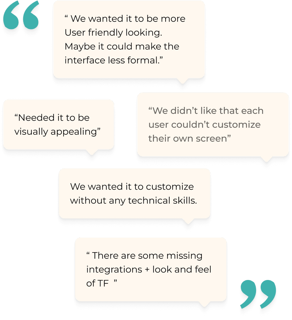
To understand our current users needs and pain points related to the redesign project, we collected feedback from our community site where clients can ask questions and provide feedback. This research helped us identify and prioritize areas needing improvement and develop potential solutions.
Potential users
To understand our market position and the needs of potential users, we gathered feedback from companies that requested demos but chose competitors' products over ours.
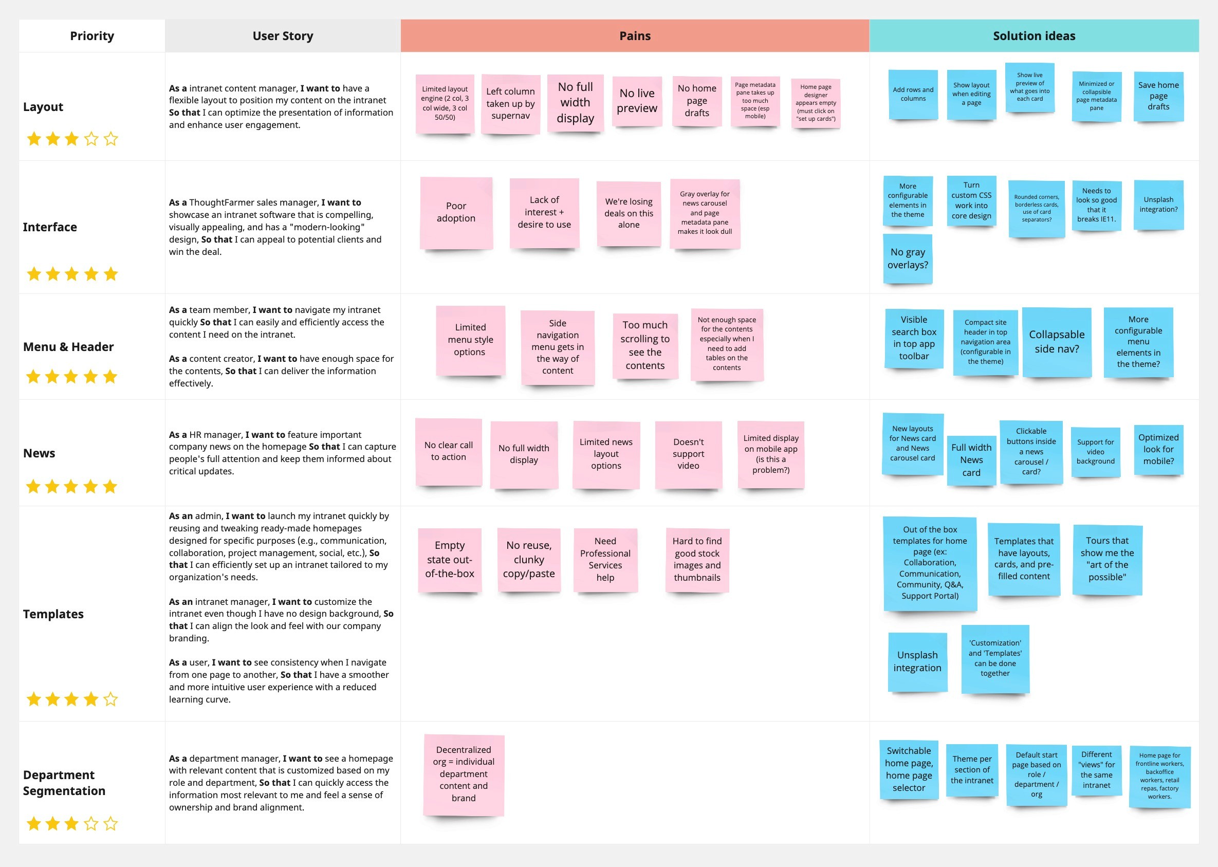
After conducting user research, we developed user stories to identify current pain points and potential solution ideas, and we prioritized them. Based on this, we established the project goals.
Project Goals
Goal
01
Enhance Visual Appeal and Increase Customization
Goal
02
Goal
03
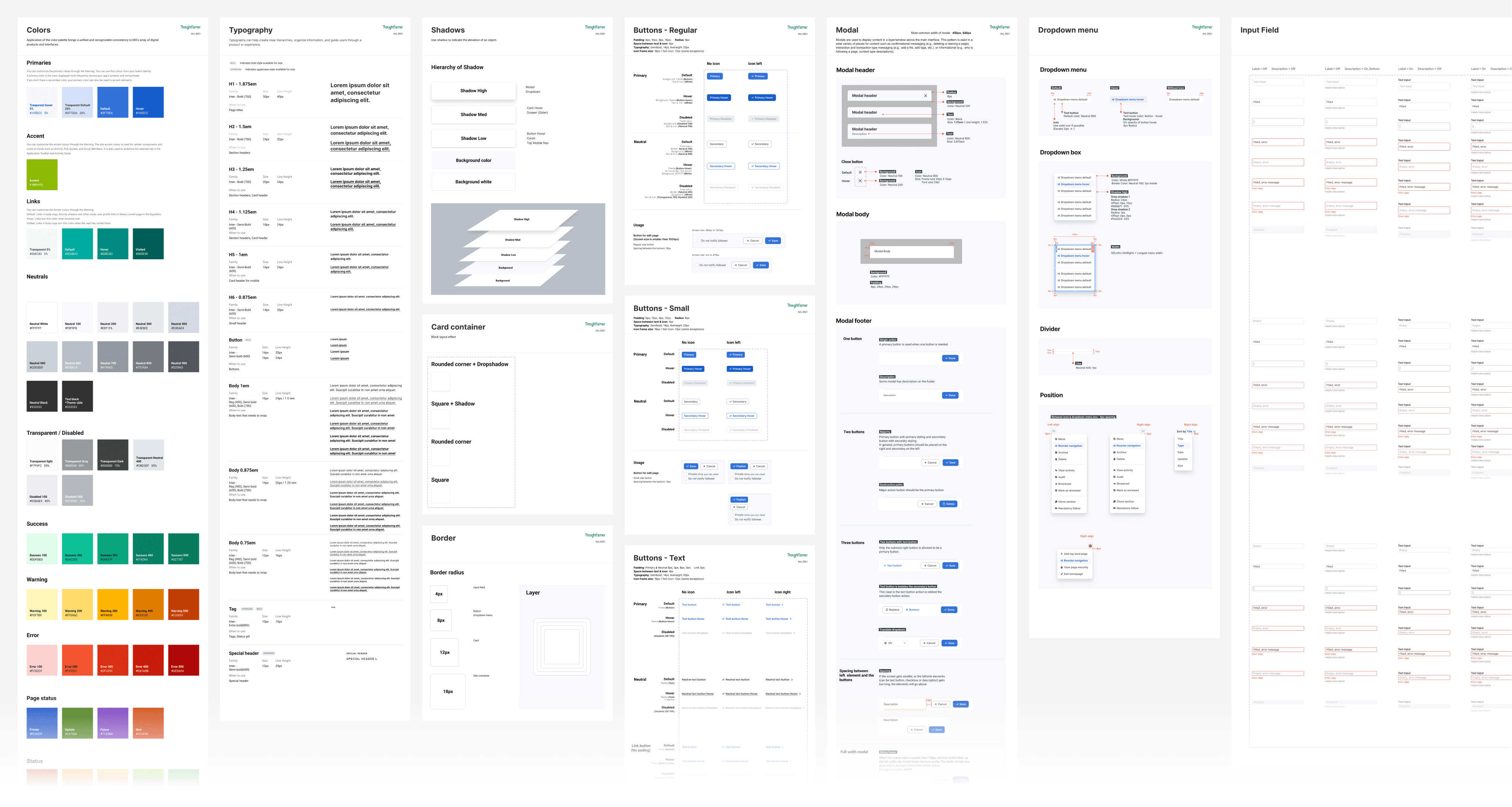
01. Design system
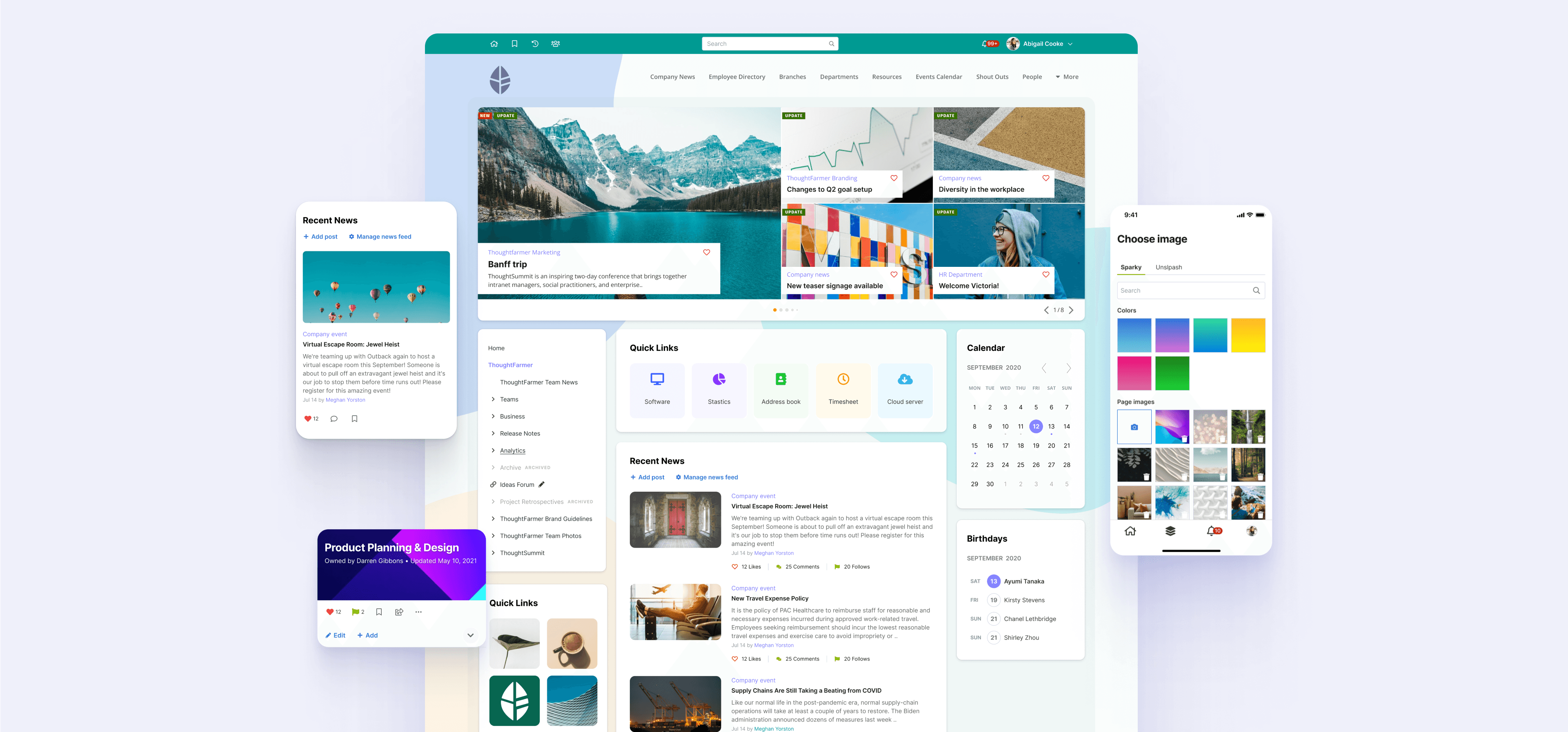
ThoughtFarmer software has been in existence for over 15 years. So far, the company has prioritized only functional improvements, resulting in an outdated appearance for the product. To modernize the product's look, we first overhauled our design system. This involved updating each component to achieve a fresh and cohesive look, addressing the platform's outdated aesthetics, and enhancing the user experience.
02. Layout
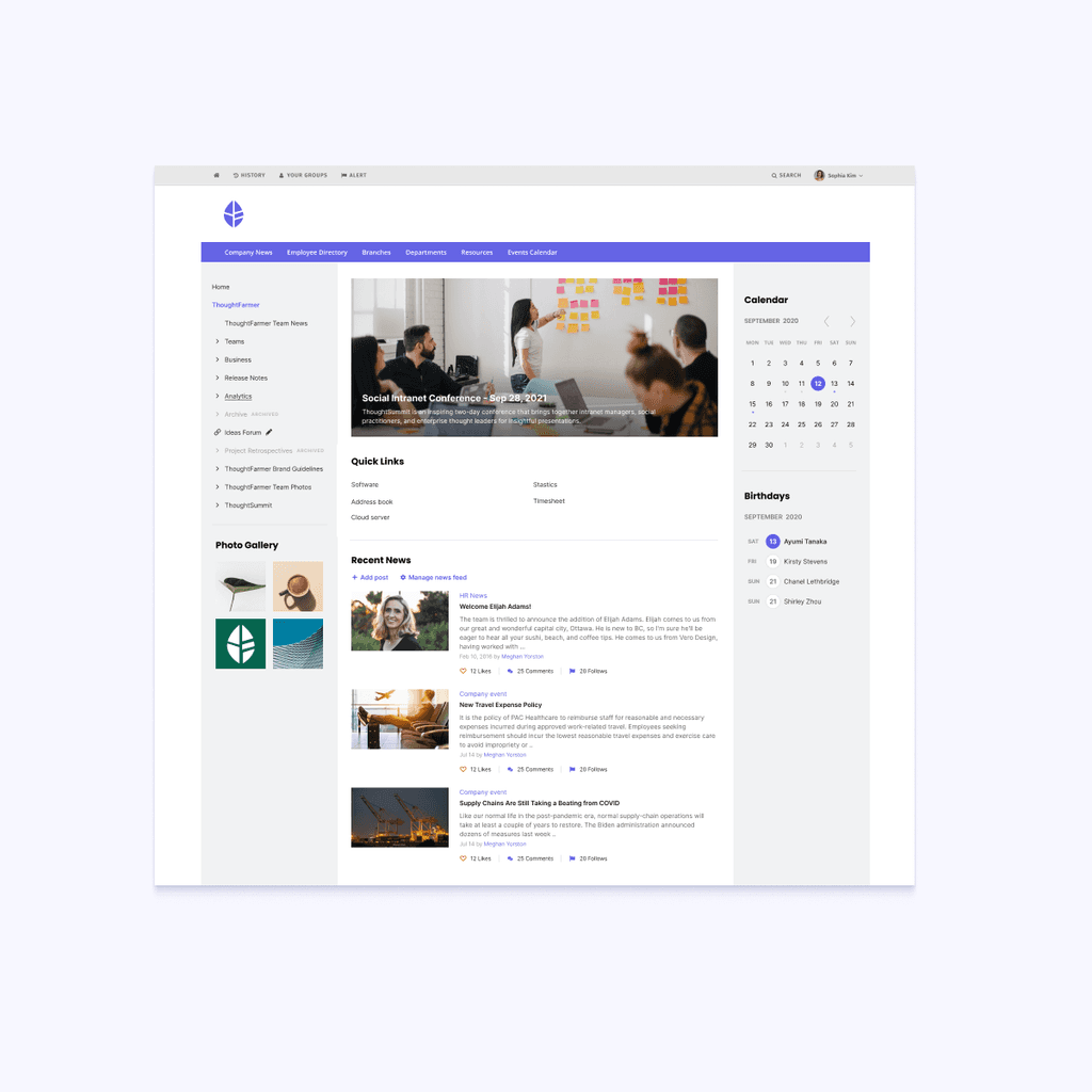
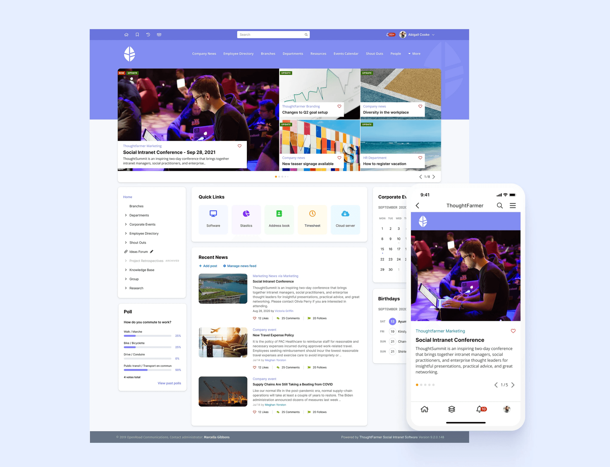
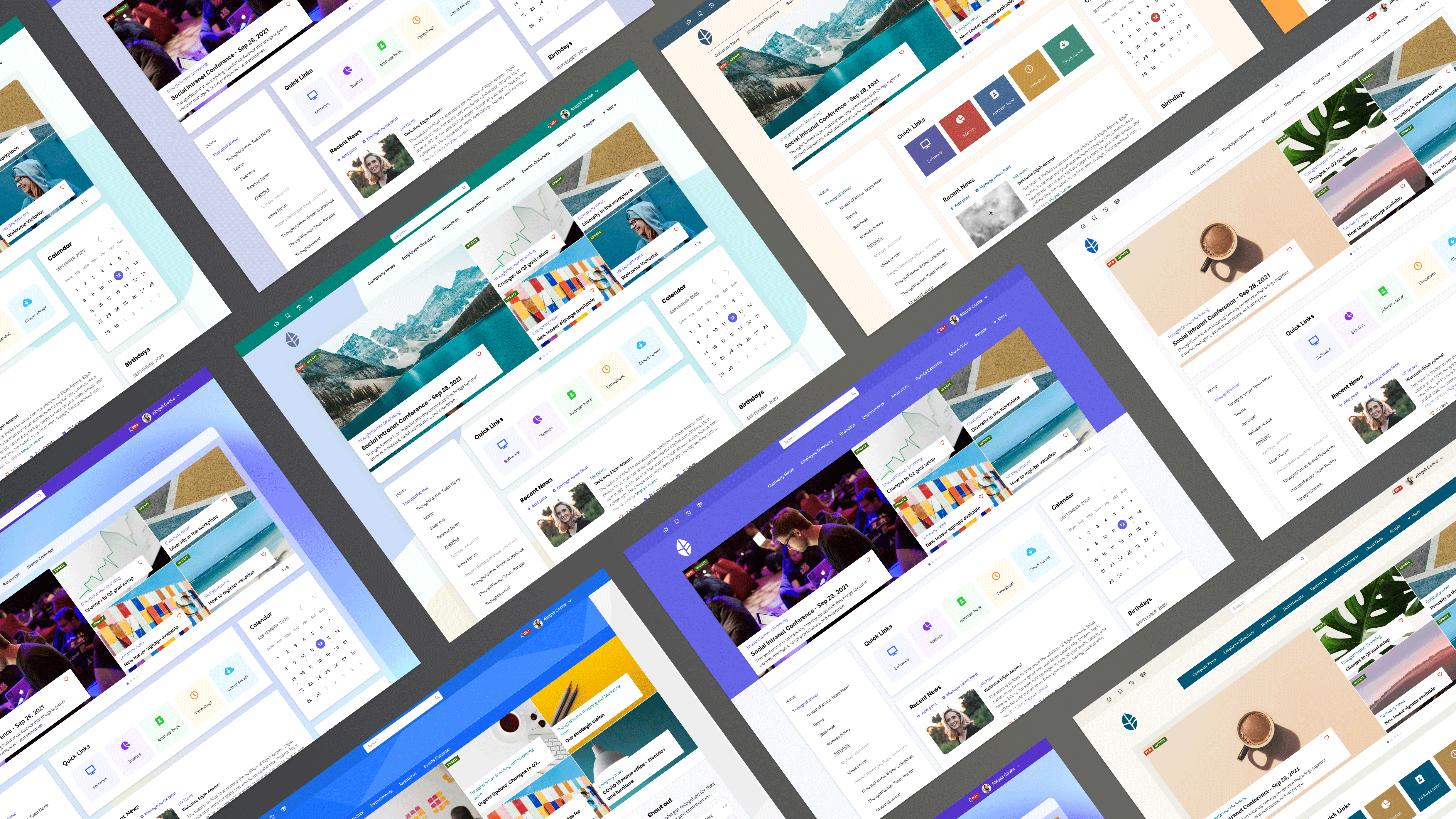
To improve the appearance and flexibility of customization, we modularized the cards and restructured the site layout. The old design relied on a divider line and dark grey background, making the intranet look outdated and inflexible. By modularizing the cards, each one became visually separated, emphasizing the layout of each page and providing more customization options. However, some existing clients were concerned about migration risks, so we kept the old design as an additional option.
With the updated layout structure, it was necessary to revise the way to configure the layout. This can now be controlled from the theming console in admin panel.
03. Admin Theming Console
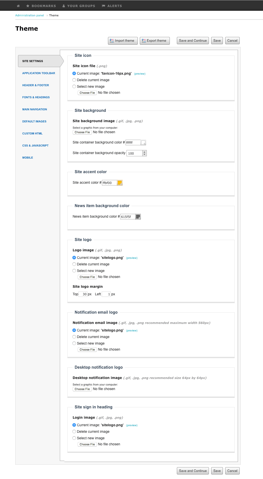
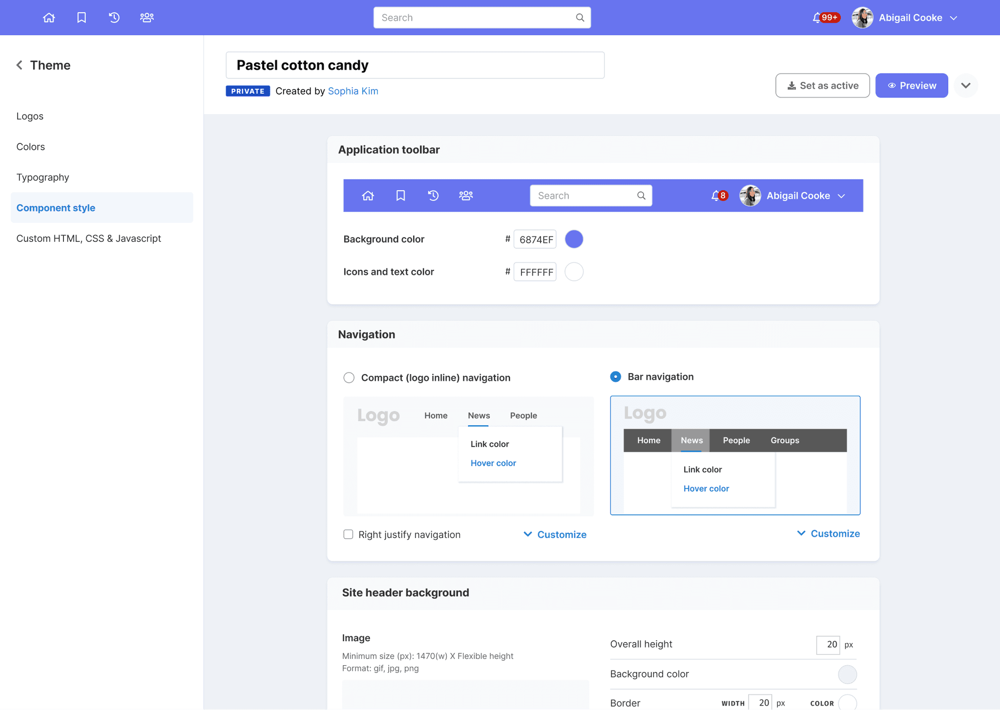
As part of the redesign project, we updated the layout and some global settings, necessitating an update to the theming console. The theming console is a white-labeling feature that is one of our selling points, allowing users to customize and align the platform with their brand. While we decided to update the theming console, we wanted to discover any additional issues in more detail.
Problems
Users found it challenging to locate where they could modify components, and even when changes were made, they were uncertain about what exactly would be updated.
The platform only allowed one theme to be applied to the site. Users expressed a desire to save drafts and share them with others before publishing.
Solutions
Update site map
Introduce preview
Add theme selection page
Auto save as draft
04. Update cards
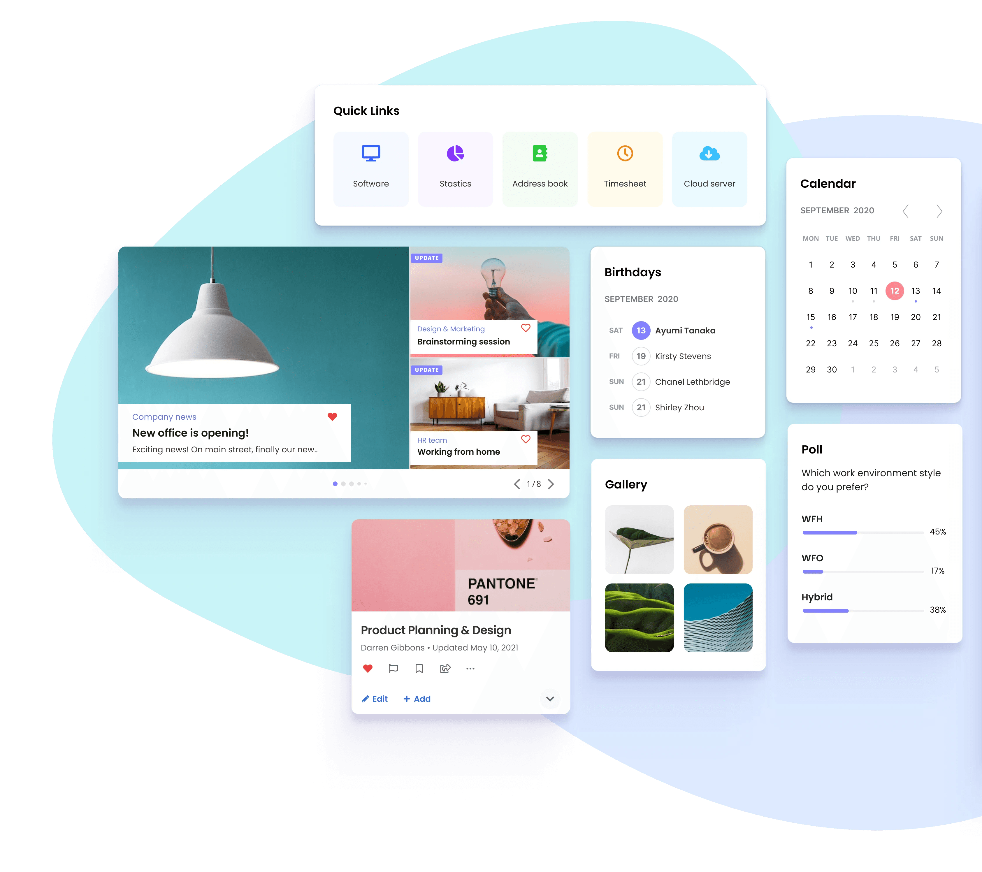
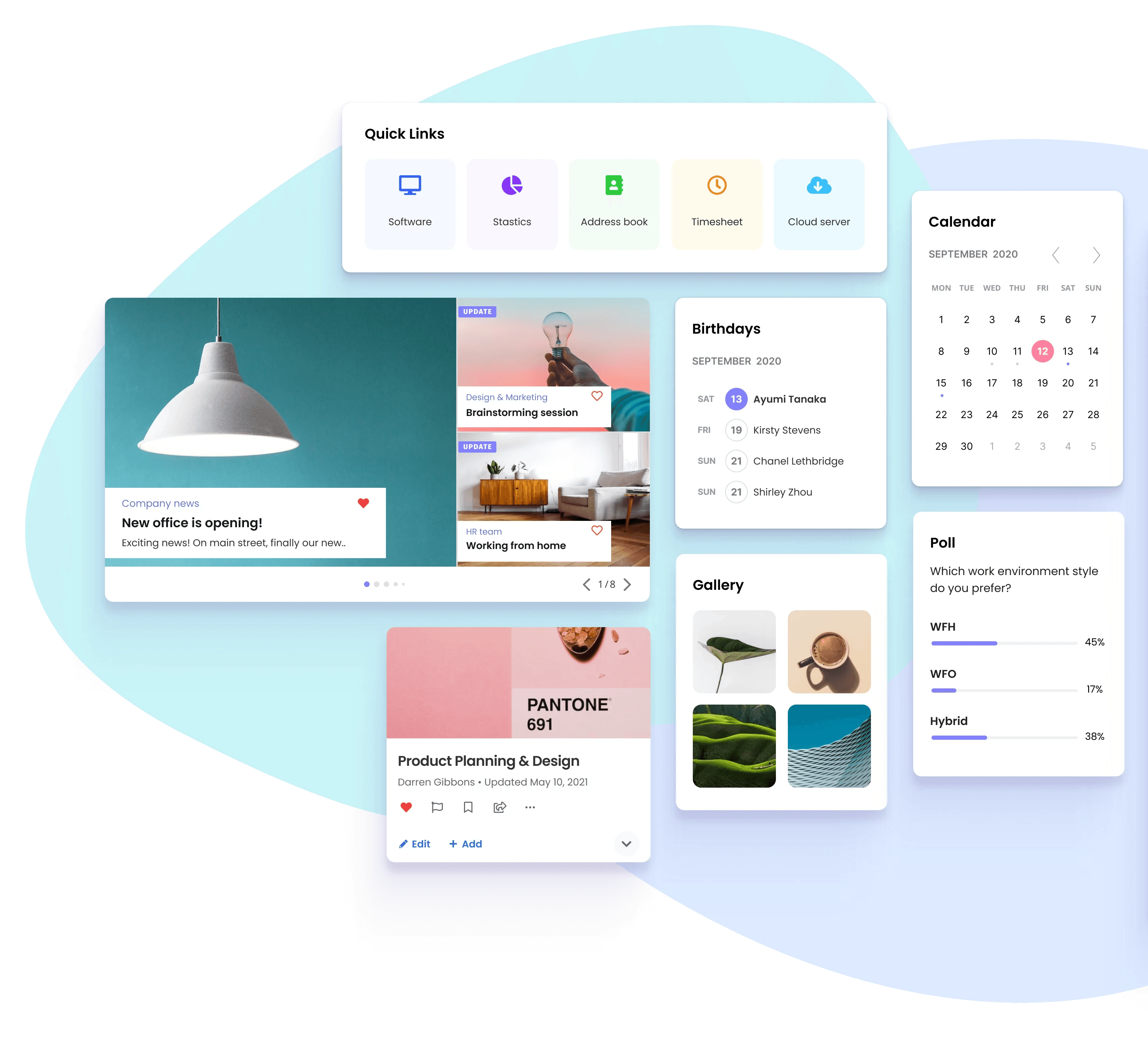
The process of building the intranet homepage with ThoughtFarmer involves using drag-and-drop cards such as 'News', 'Event Calendar', 'Poll', 'Shout-out', etc. Since the site is a collection of these cards, it was necessary to enhance the design of each card to improve the overall look and feel of the site.
Here are some of the cards update examples;
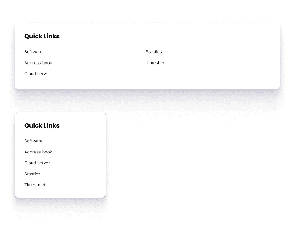
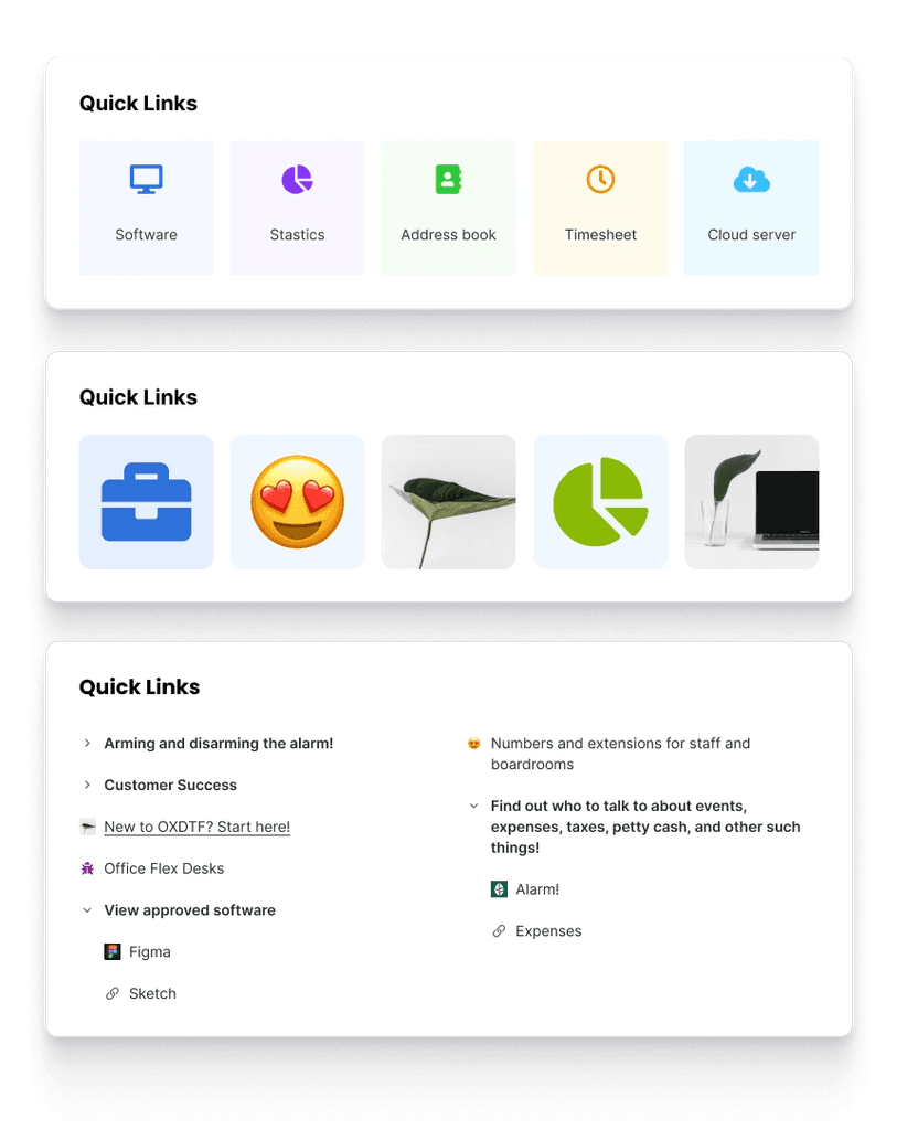
The Quick Links card lets users add helpful links to their homepage or group page, making it easier to access commonly used resources. Adding visuals to Quick Links helps users find the right link and makes them more visually appealing. Many customers want different layout options for Quick Links to make them more visually appealing and easier for their staff to find the links they need for their work.
Problems
Sole reliance on displaying text diminishes interest in the site.
Poor aesthetics when the card is positioned within a wide-width column.
Lengthy lists can be overwhelming.
Solutions
Introduce different display styles (icon, emoji, or uploaded image).
Implement a categorization feature.
Introduce a grid layout option.
Solution Part 2
Optimize Menu and header area to improve contents accessibility
Contents page header
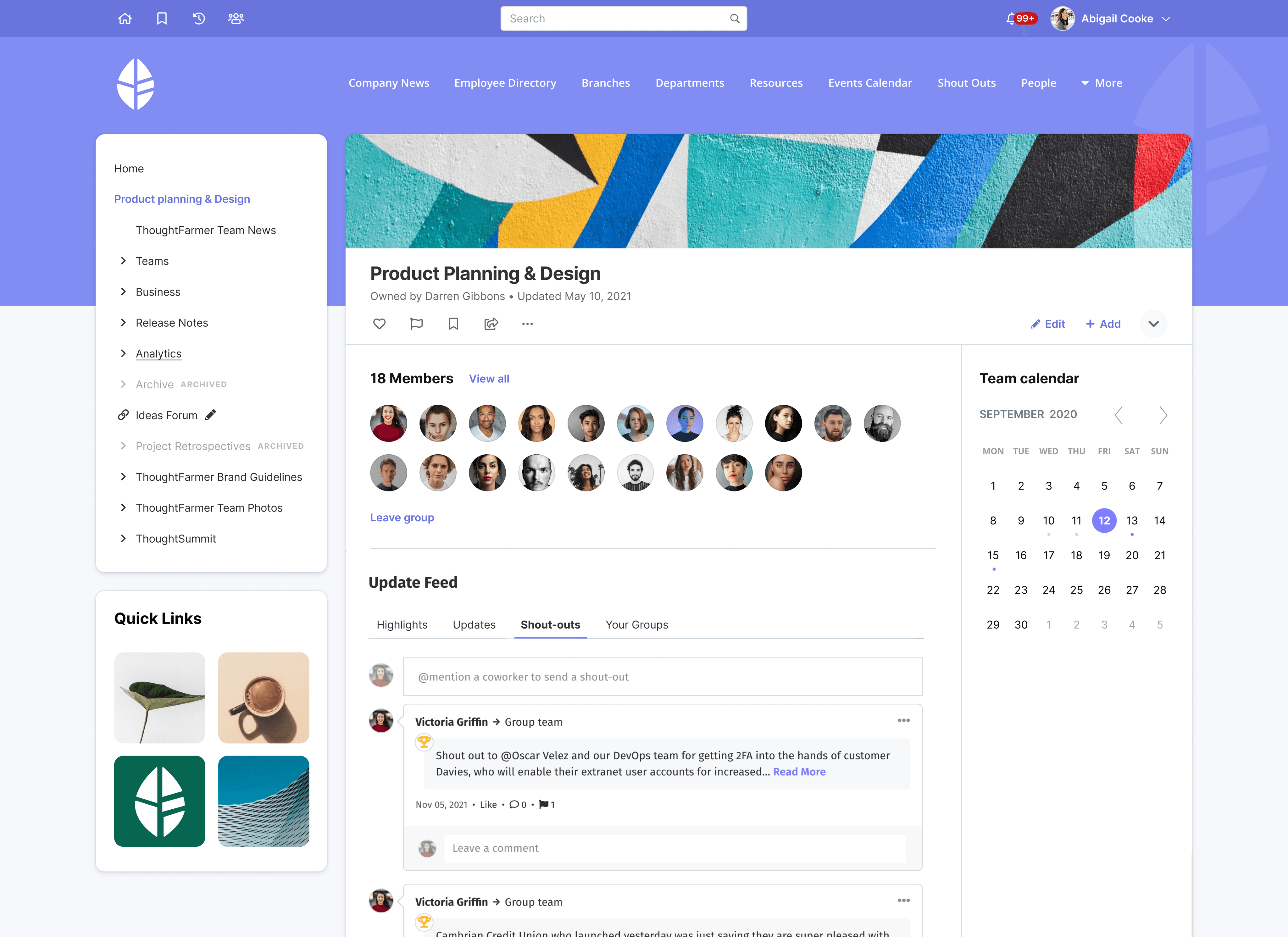
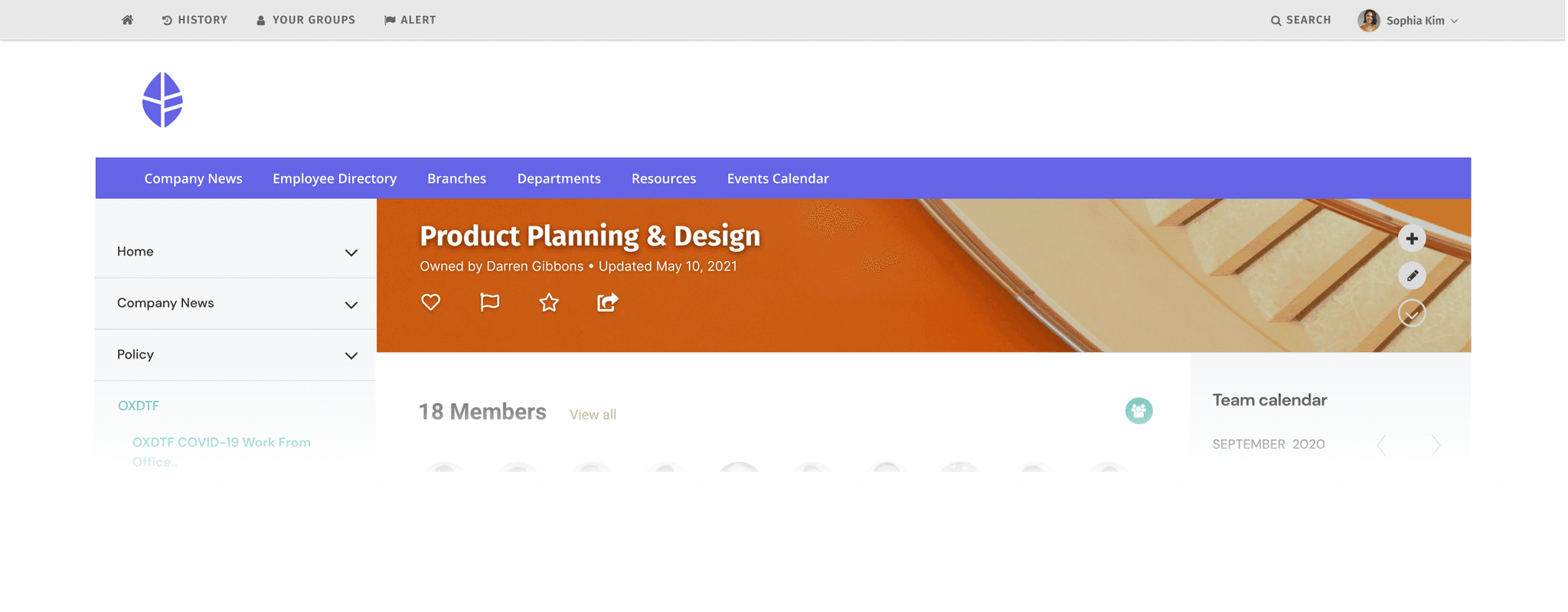
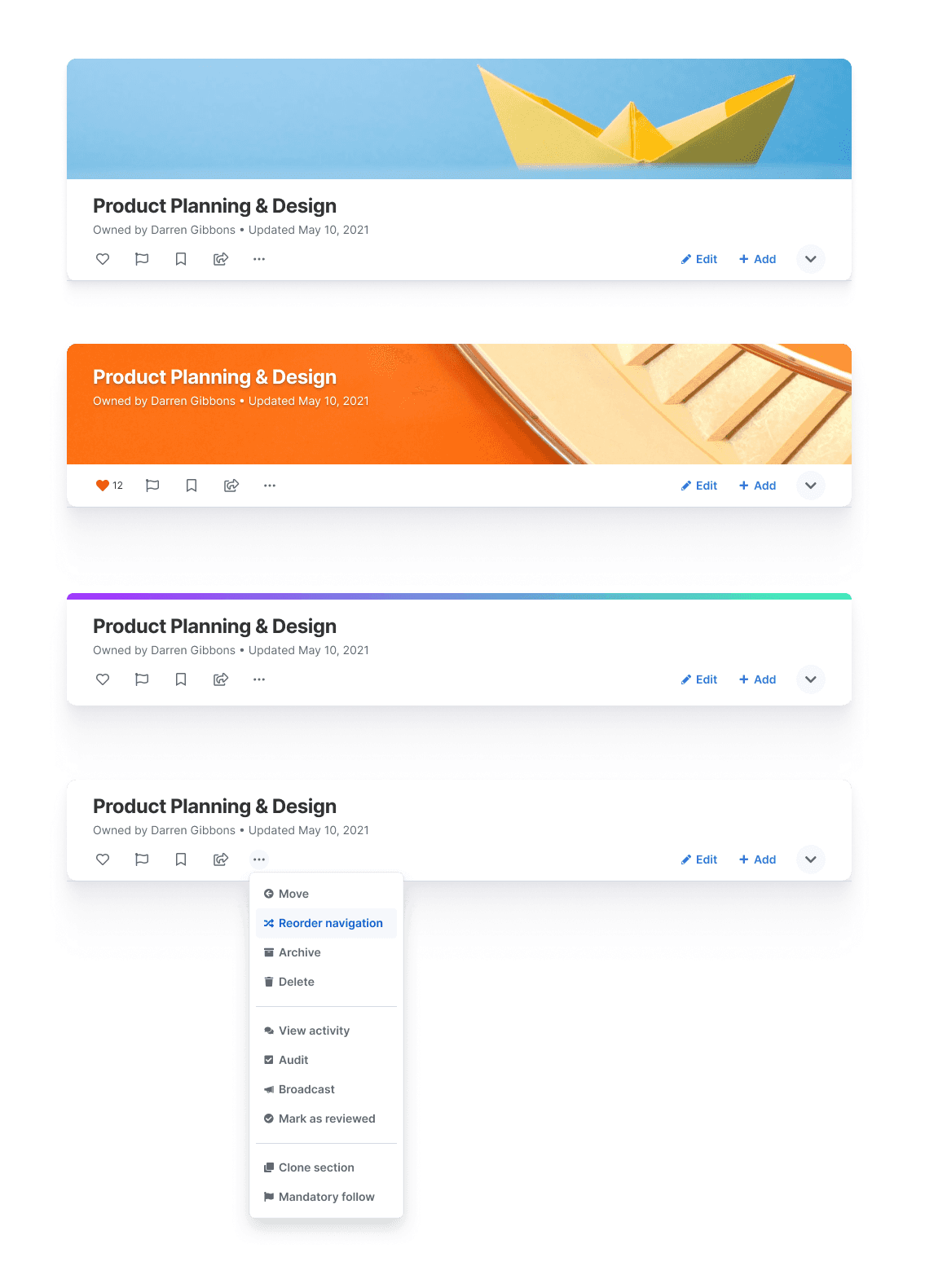
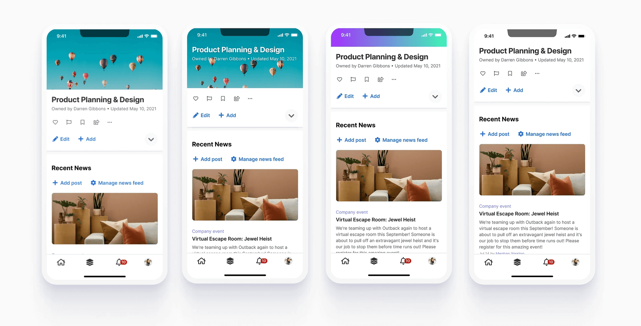
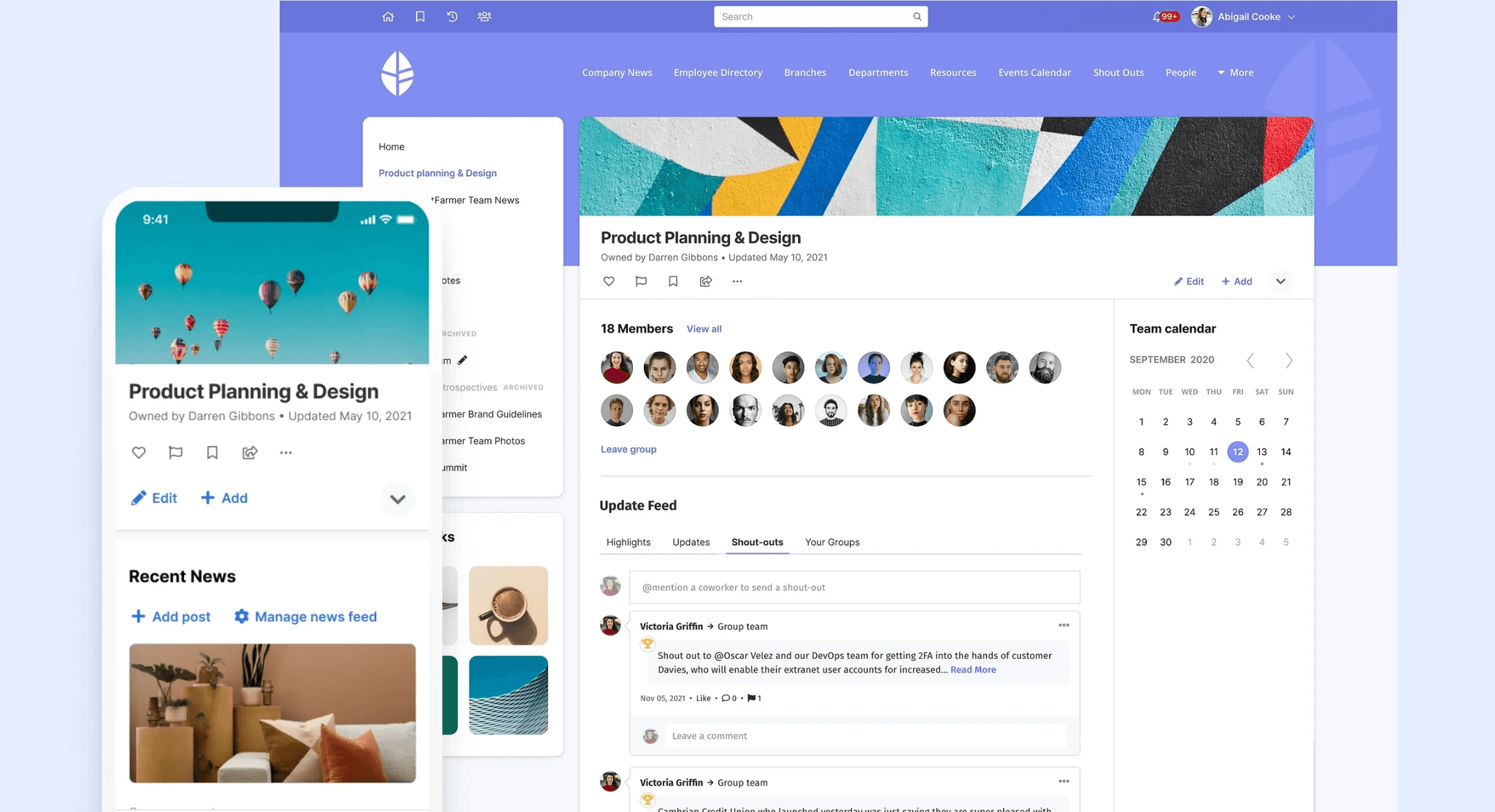
A page header can add visual interest and either uniqueness or continuity by including a page header image. It's the area below the main navigation that holds the page title, add and edit buttons, and social and page actions. A unique image can make a page stand out, while using the same header throughout a section can maintain consistency. However, some clients feel the header takes up too much space, requiring them to scroll down to see the content. To address this, we introduced a content-focused option.
Problems
Inefficient use of content page header space
Visibility and readability challenges with image overlays
Inconsistencies in header image cropping across screen sizes
Solutions
Height Reduction Option for Header
Repositioning Buttons and Text in the Header Area
Improvement of Image Cropper for Enhanced User Experience
Solution Part 3
Improve News Delivery &
Employee Engagement
News carousel
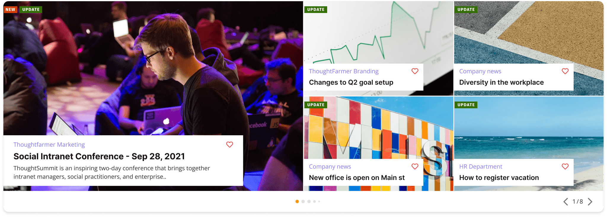
News is one of the most important features of the intranet. 'Company news', 'Team announcements', or 'Upcoming Events'—all of these items are likely to appear in the news carousel at the top of the homepage. We often hear suggestions from clients on how to make the news carousel more engaging.
Problems
There is only one option of the carousel design. Often our clients use this card as a hero image area on the homepage which should be impactive.
Same as contents page header, it has accessibility issue since the text is positioned on top of the image.
Challenge
The new layout might cause issues for existing news. Therefore, I decided to keep the original layout as an additional option.
The new layout has different aspect ratio of the images. So I needed to update image cropper as well.
Solutions
Introduce multiple design options for the carousel to provide variety and impact
Improve accessibility by re-positioning the text within the carousel
Update image cropper
Final
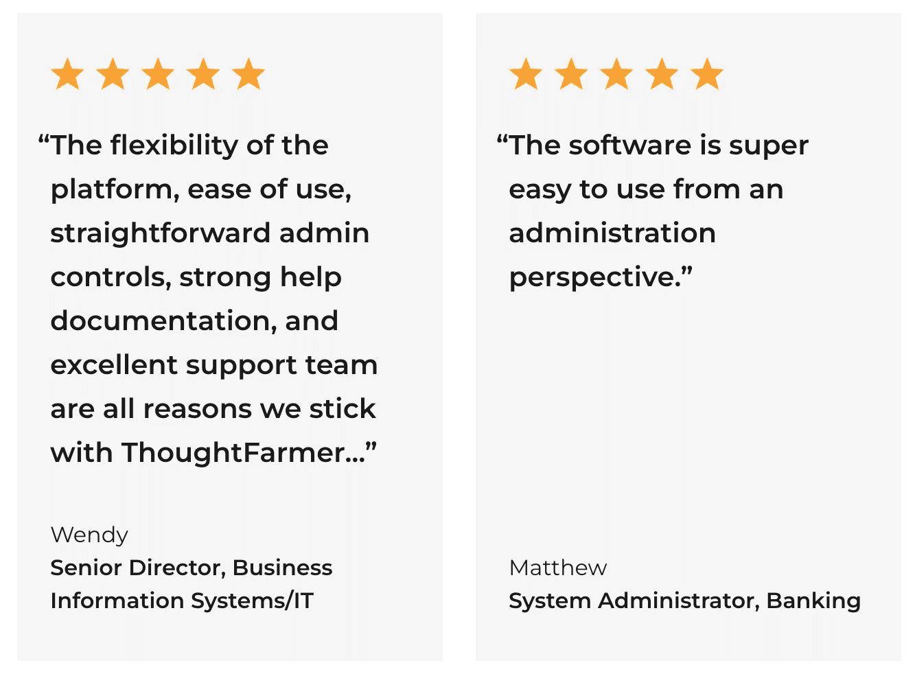
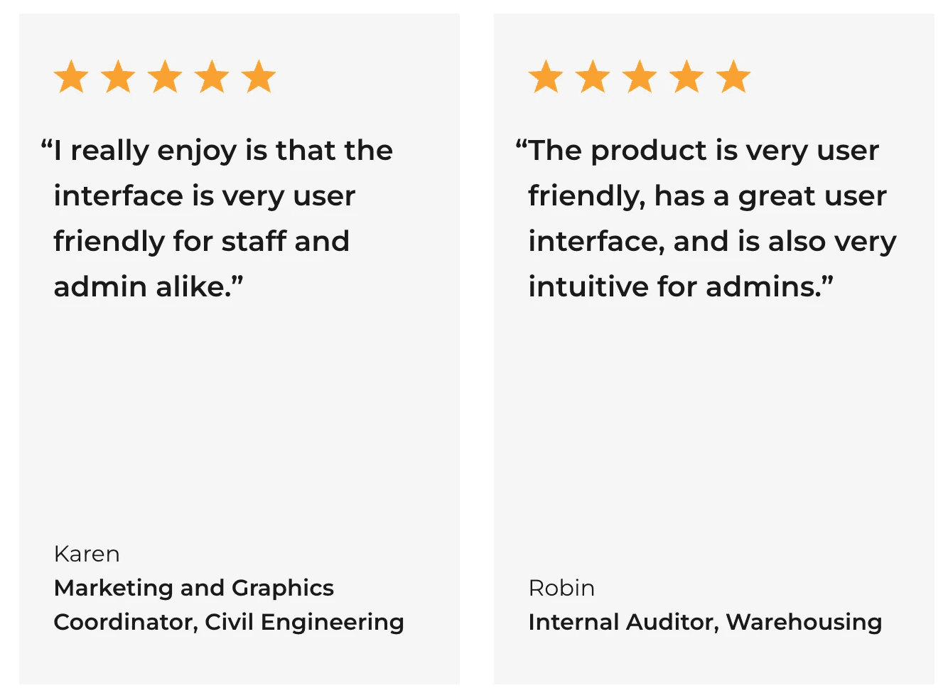
Business Impact
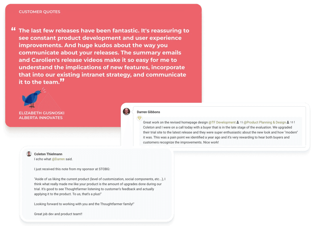
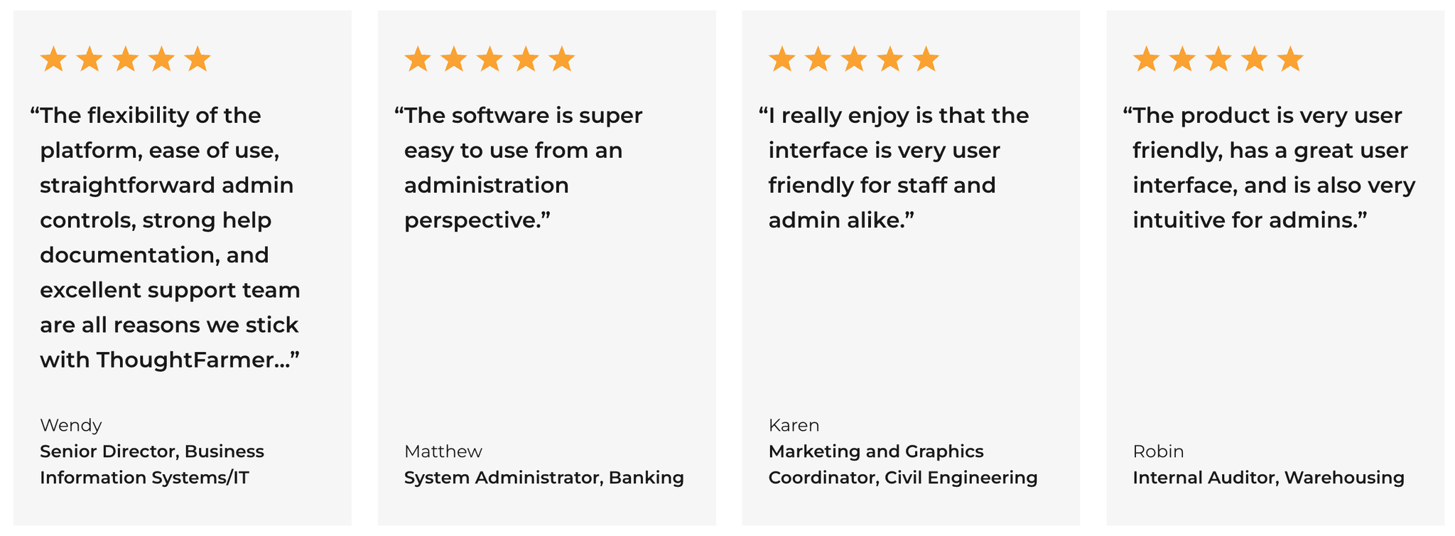
We received a lot of good customer feedback for each feature deployment, which was reflected in sales.
